Ballantine’s
Whisky
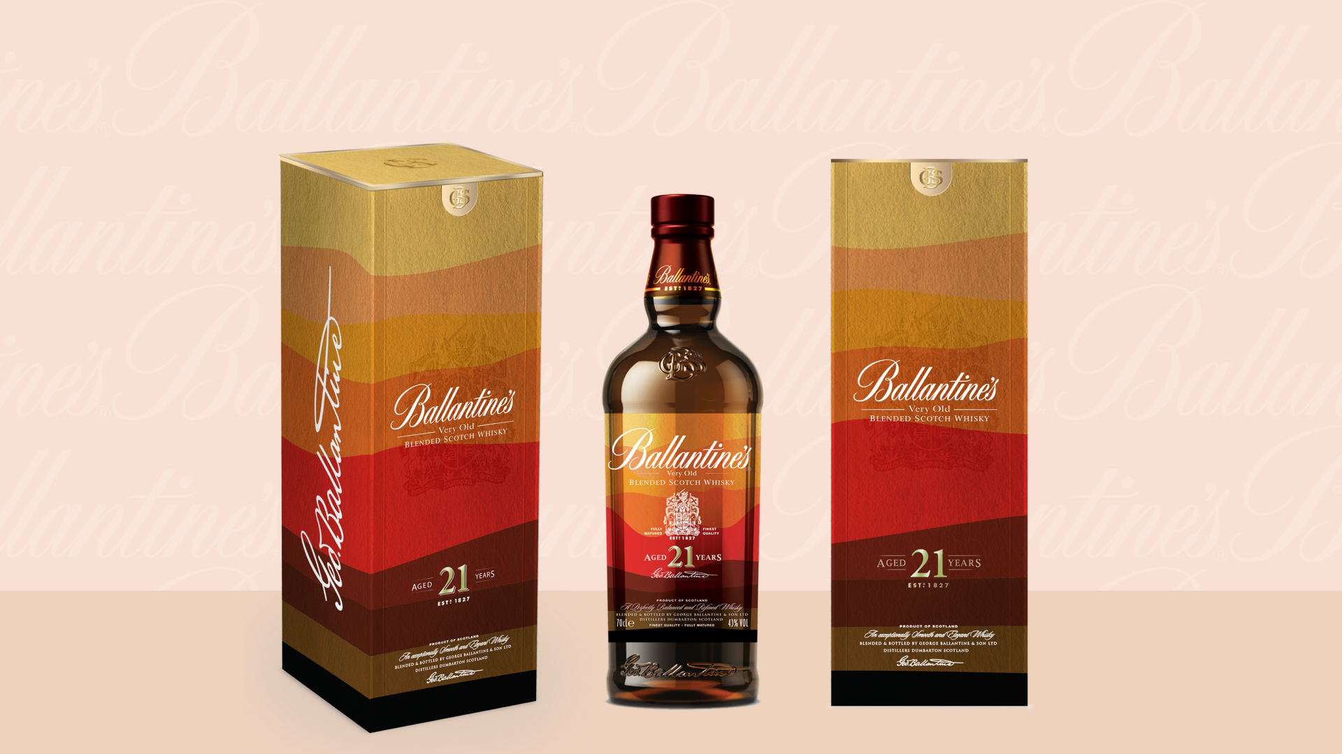
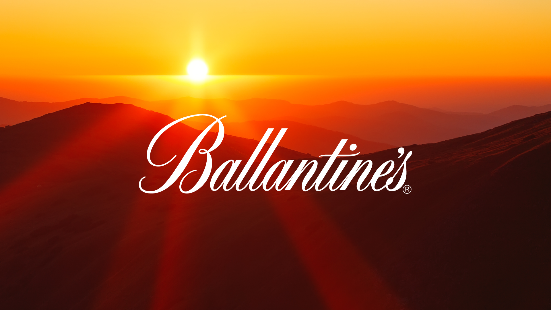
Ballantine’s held a competition to design their limited edition packaging — which would represent the bold flavors of their 21 year aged whisky — emphasizing key ingredients such as cinnamon, ginger and licorice. Taking inspiration from the warmth of a sunset, the packaging and label illustrate the intensity of the bold flavor notes, while beautiful, vibrant and powerful colors seamlessly blend together through abstract design and organic layers.
Packaging design
Design Direction:
Warm • Bold • Spicy • Simple


